Typo Berlin
2020 | Schoolwork
This project is done as a school task and is not in collaboration with Typo Talks Berlin! Typo Berlin is an annual conference that is focused on typography. Each TYPO has a topical theme, which the invited guests explore in their own personal ways. It might be trends in society, personal ideas, technical innovations or the effective laws of good design. The latest Typo conference was in 2018 but in my graphic design studies I was given the task of imagining what a TYPO 2020 might have looked like. We were given a short timeframe as the project was given to us in the morning and was to be presented at 3 PM the same day.


Thoughts
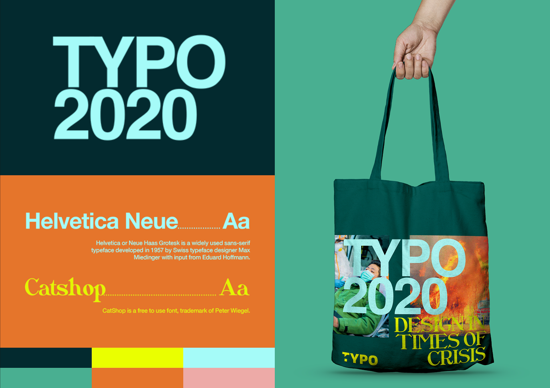
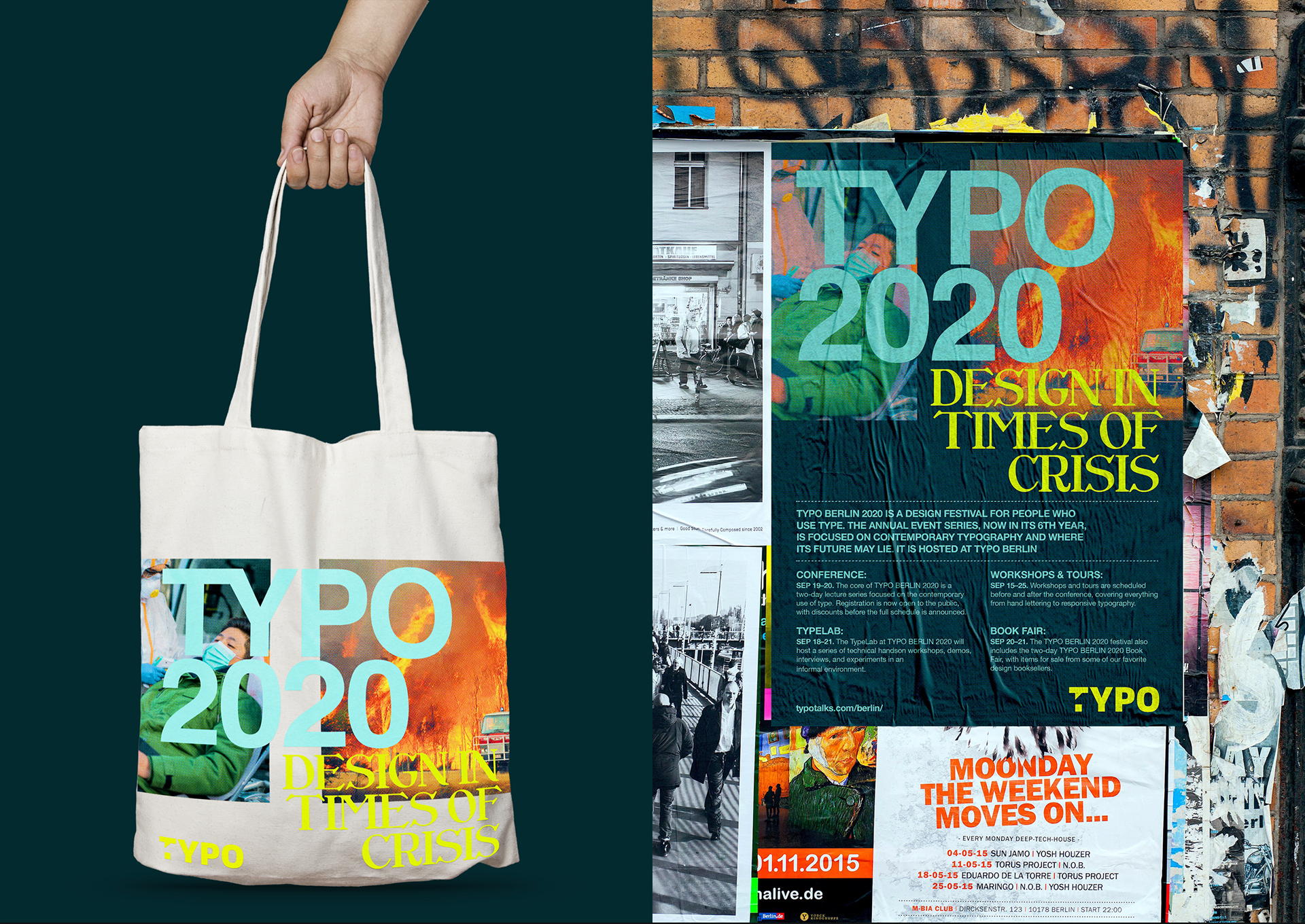
In a short task like this there is less pressure to perform so I took this opportunity to play around with the visual language to create something that felt modern and a little offbeat in a way that fit the time (annus horribilis 2020) and place (Street art heavyweight Berlin). When designing a graphic profile for a typography conference there is of course a lot of pressure on your choice of fonts and if I had had more time maybe I would spend it choosing a less overused font than Helvetica Neue or a more widely accepted font than Catshop, but my goal in choosing these fonts was to show the old and the new.
Helvetica represents a long history of typography and also has connections to the Bauhaus movement making it a fitting choice for an event in Berlin. It also gives the needed authority and readability for the amount of information that makes up the body text in the poster for example. Catshop on the other hand was chosen to represent new trends in typography. Personally I see a rise in the use of decorative fonts, many of them taking inspiration from Art Nouveau. The font also works well in contrast to the more sober title font.
The Image processing is also deliberate. the images are treated in photoshop with halftone filters among other things to make them resemble pictures printed in daily newspapers. This is to add an impression of urgency, as if these posters had to be printed very quickly and in great numbers.